
Logo Design for Liam: A Symbol of Connection and Leap
Text by Ayumi Kumano
Published
Building Systematic Consistency
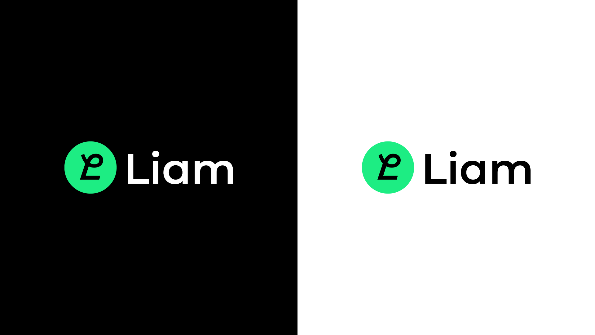
The Liam logo was designed with a core focus on visually expressing "connection."
By abstracting the UI concept based on Nodes and Edges, it embodies the organic links between information and data.
The essence of visual design lies in organizing complexity and conveying clarity.
The Liam logo follows this principle, pursuing refined simplicity.
Alignment of Naming and Vision
Liam /ˈliːəm/
Derived from the phrase "Leap into a masterpiece," "Liam" represents the act of transcending boundaries and diving into a masterpiece.
This name is intended to foster creative exploration and embody a unique vision.
"Liam" symbolizes challenge and growth, reflecting an attitude of pushing beyond constraints and testing one's own limits.
This spirit represents a strong will and passion for pursuing creative activities and achievements across various fields."Liam" envisions a world where anyone can create innovative applications beyond technological barriers.
- From Liam Naming Development
As a tool that empowers users to surpass their own limits and create true masterpieces, Liam expands possibilities infinitely.
The name "Liam" originates from the acronym of "Leap into a masterpiece."
It symbolizes creative leaps, value creation, and a spirit of challenge.
Furthermore, the letter "a" incorporates positive connotations such as "awesome" and "amazing," allowing for flexibility in context. This adaptability is one of the defining characteristics of the Liam brand.
The Shape Design Process
In the early design stages, we explored a direction inspired by cyberpunk visuals and futuristic control panels.
However, while this approach had strong visual impact, we realized it was not the optimal solution for intuitively conveying the essence of the brand.
We then refined our direction, integrating the UI structure of Edges that signify connections with the concept of "Leap."
By meticulously selecting and streamlining elements to the bare essentials, we arrived at a form that accentuates its core essence.
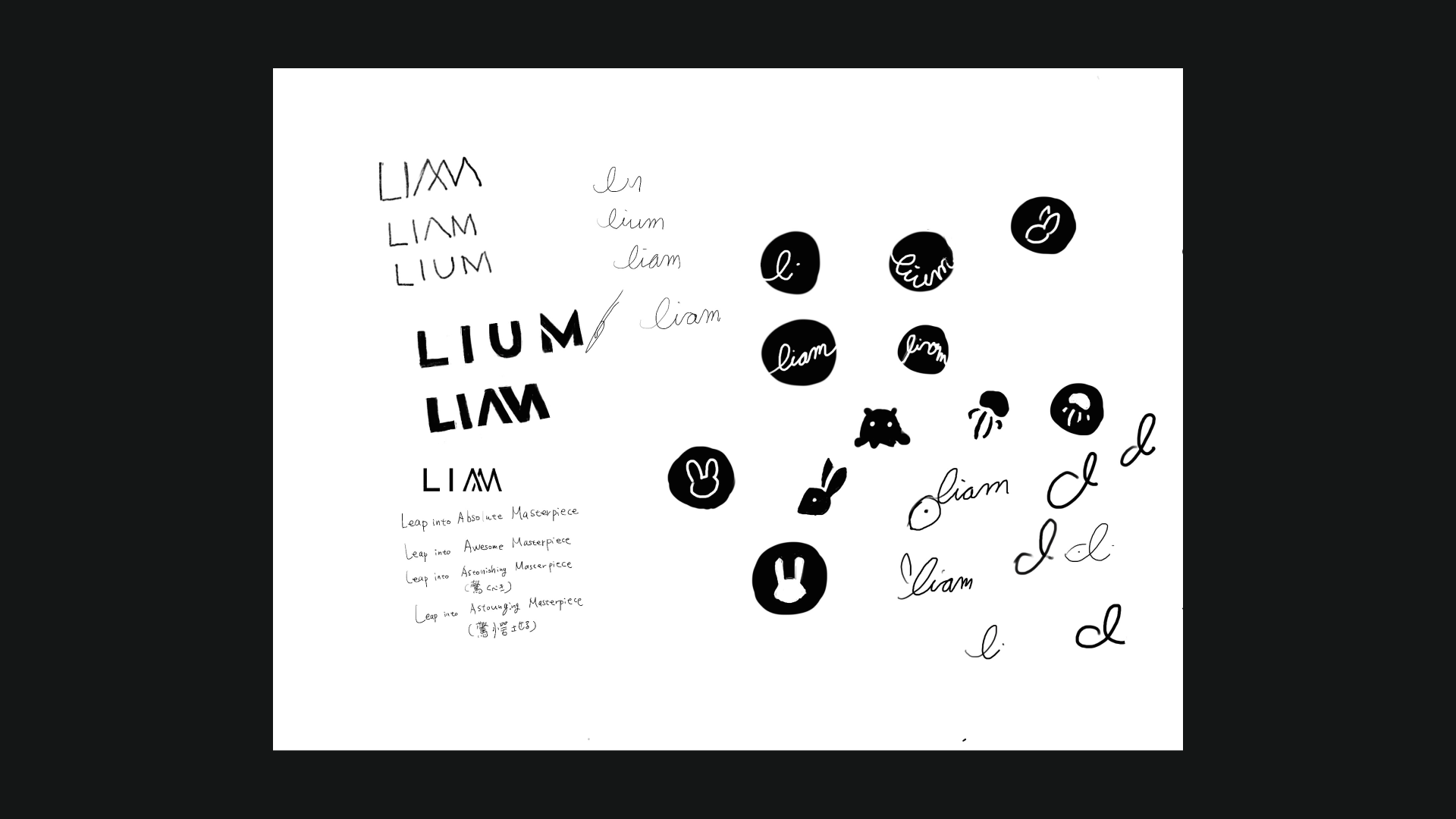
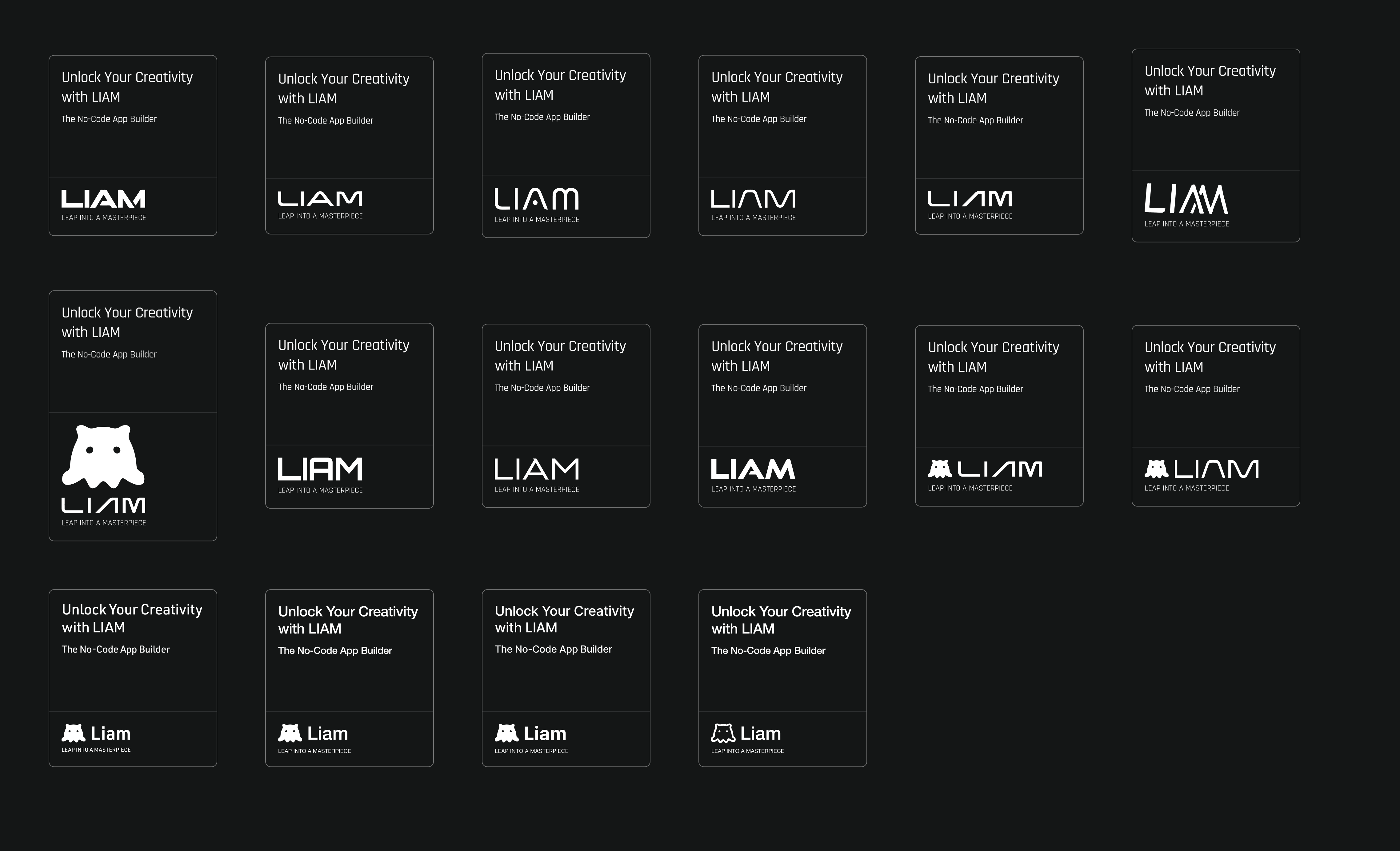
Reevaluating the Design Process
"Do not go gentle into that good night."
- Dylan Thomas
The most crucial aspect of the design process was "eliminating preconceived notions."
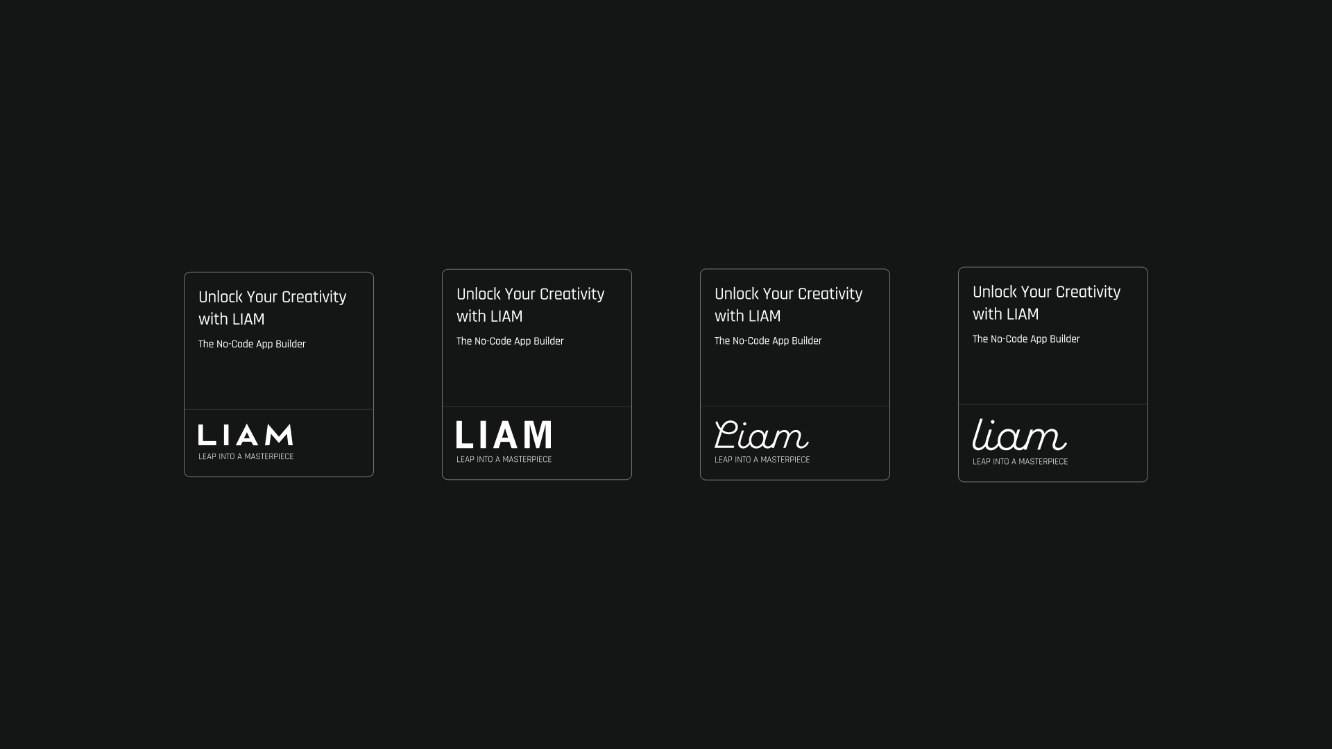
It is easy to become attached to early design drafts, but to create a truly satisfactory design, one must sometimes have the courage to reconstruct it from scratch.
By repeatedly reassessing the concept and refining even the smallest details, we ultimately arrived at the final design.
The Role and Intention of Typography
The typography of the logo balances individuality and functionality by employing different fonts for the symbol mark and logotype.
-
Symbol Mark: American Auto Demo
A geometric and minimalistic composition.
A dynamic form that embodies the concept of "Leap." -
Logotype: Montserrat
A modern and refined design.
High readability, ensuring visibility across all devices.
This combination elevates the design, integrating the brand’s innovation and stability.
A Strategic Approach to Color Selection
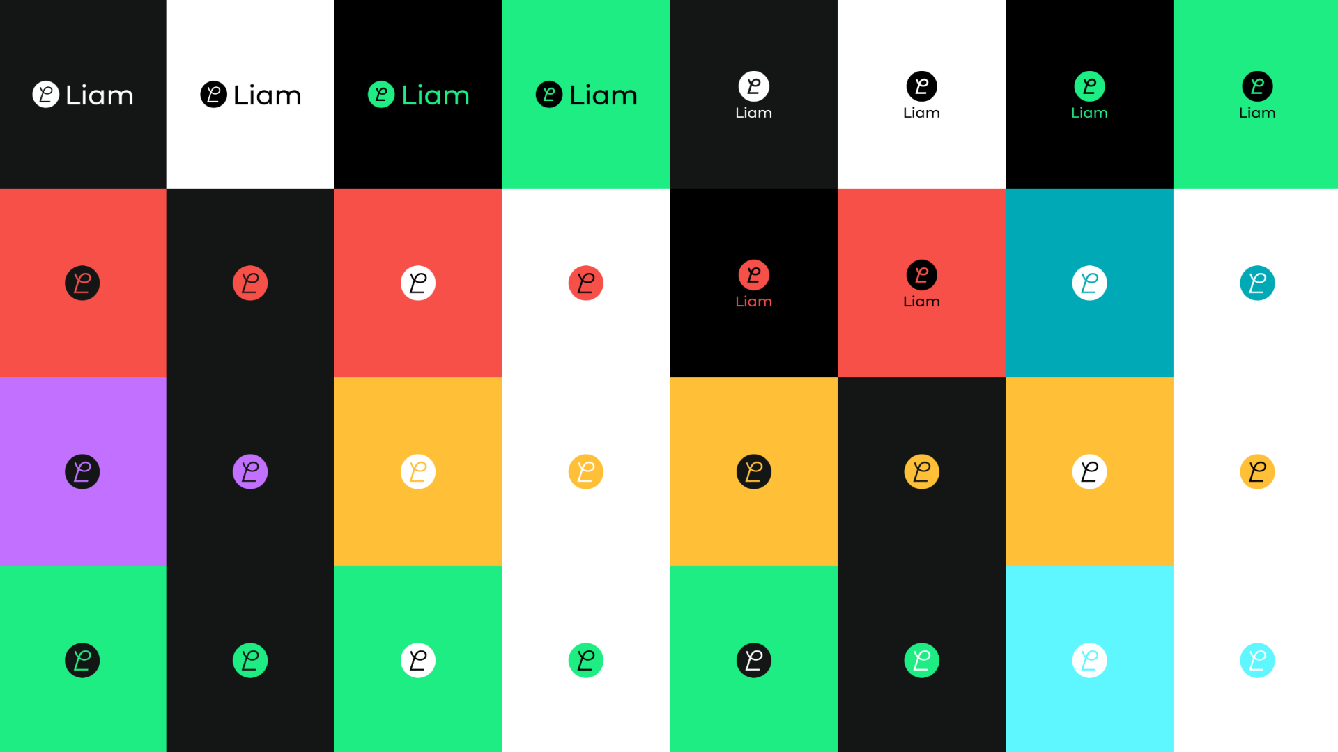
The brand color was chosen to balance visibility and uniqueness—a vivid green.
Initially, we considered teal blue, but we re-evaluated in pursuit of a more striking presence.
As a result, we adopted a vibrant green that stands out even in dark-mode UI.
This color embodies both "innovation" and "approachability," striking a balance between the brand’s forward-thinking nature and reliability.
Optimizing for a Global Perspective
The Liam logo aims to combine visual impact with approachability.
Rather than a design that simply overwhelms the viewer, it draws them in naturally and makes them feel at ease.
A design that attracts rather than overpowers—this is the ideal form of the Liam logo.
Future Prospects
This logo embodies the story of the Liam brand and will continue to evolve as its symbol.
We hope it will grow alongside the brand and become a meaningful presence for many people.
Text byAyumi Kumano
Ayumi Kumano is a product designer at ROUTE06, Inc., working on Liam. Specializing in user experience, interface design, and creative design, she focuses on shaping product concepts into intuitive user experiences and enhancing product usability.
Last edited on
There are currently no glossary entries for this blog post.